The big battle for survival. 2013 is going to be a do-or-die battle for many notable mobile companies, so expect aggressive products with cutting edge technology, design and features and also good amount of marketing blitzkrieg.
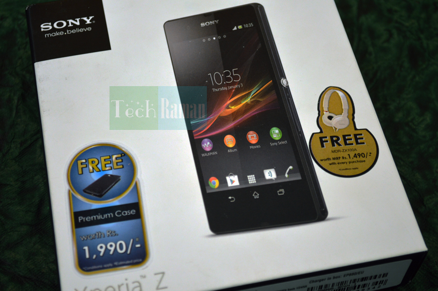
Sony has declared it would like to be the third biggie in the mobile league with Apple and Samsung sitting comfortably on the top. So, the Japanese giant might be heard ‘May the force be with us’ with the launch of it’s new flagship model, Xperia Z. Going by the early indications of the device Xperia Z does indeed has the momentum in it. Oh, wait any doubts on that? We are here to find it out and let you know in our Sony Xperia Z review.
A super- slim design cased in glass slabs, crispier large display and who-cares-about-dust-and-water am born resistant makes Xperia Z pretty interesting and a phone that shouts no-nonsense attitude and commands attention, something which was rarely seen from Sony of late.
My initial thought? Sony does finally seem to have got a hint of how a flagship device really should be and the targeted buyers pulse.

The Design – Dressed to kill
First impression is the best impression has been told and retold many a times, as I caught my first glimpse on Xperia Z, it got all the right vibes to impress. A plain black slab? Yes but Sony manages to present it beautifully and the device looks all premium and high quality. Made of tempered glass both in the front and back with reflective coating and fibreglass inserts on the sides, Z looks classy with solid built. No glossy plastics and chrome embellishments here, thankfully. Being a 5-incher , the Sony Xperia Z is undoubtedly large at 139 x 71 x 7.9 mm, occupying your entire palm though it does not sit awkward in hands and we get used to it pretty quick. Weighing 146g, it is heavier than iPhone 5 but then hey, it is quiet bigger and dwarfs the apple phone. So for the large device, it does feel light on palms and no one should be complaining. Being water-resistant and dust-resistant, Xperia Z is well encased and closed, so all the ports and slots are closed by watertight port covers. The ports are spaced out neatly with the headphone jack up top, the microSD and charging ports are on the left, alongside contacts for accessories. The most attractive design feature that adds to the style volume is the protruding silver power/standby button similar to the crown of a watch. It is flanked on either side by the SIM slot and volume rocker. On the bottom there is no port but you get a lanyard hole.The hardware – dressed to perform
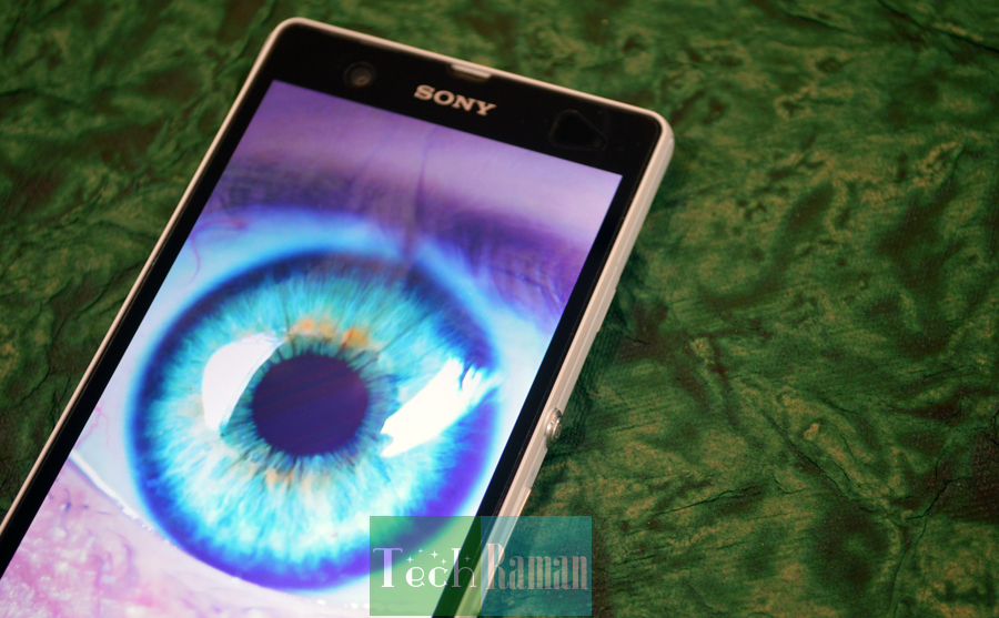
We mentioned Sony Xperia Z features a 5-inch display. Now more about the display, it’s a TFT display with a 1080 x 1920 pixel resolution that packs in a 441 ppi pixel density. The full HD display may not be featuring a AMOLED screen or super LCD 3 but the display is quiet vivid,bright and crispier. Thanks to Sony’s own Mobile BRAVIA Engine 2 what you see on-screen be it images or texts look brilliant especially when you look straight at the screen. Though, the viewing angles from the sides has small reasons to complain. The Xperia Z is powered by a 1.5GHz Qualcomm S4 Pro quad-core processor clubbed to a 2GB RAM and an Adreno 320 chip for processing graphics. Sneaked in is a 16 GB internal storage which can be expanded upto 32 GB via microSD card. Another highlight of the Xperia Z is the ever-increasing camera mega pixels. Wasn’t it just couple of years back we were shooting with a 3 MP rear camera? It’s 2013 and not just the big phones are the norm but also bigger mega pixels, though there is no correlation that bigger the mega pixel better the picture quality. Ask HTC. Xperia Z packs a 13.1 mega-pixel Exmor RS rear camera shooting at 4128 x 3096 pixels with autofocus, LED flash along with features like geo-tagging, touch focus, face detection, image stabilization, HDR, sweep panorama along with other selection modes. The front shooter is a 2.2 MP quiet good for video calls and self shots. The camera app on the lockscreen means you can fire the shooter instantly from the lock screen. A dedicated physical camera shutter button would have been a welcome addition. I am surprised Sony decided to omit it in Xperia Z while it’s twin sibling Xperia ZL features it. Why Sony why? The Li-Ion 2330 mAh battery is non-removable. We will discuss about the battery performance especially the stamina mode later in the review.Software and Performance
Xperia Z ships with Android 4.1.2 Jelly Bean and thanks to Project butter navigation is a delight and without any lags. The device is quiet fast and blazing thanks to the software and hardware setup. Though we don’t see a heavy blend of custom overlays like Samsung’s TouchWiz and HTC Sense 5, Sony has added it’s own few tweaks and customizations. When you on the phone quiet an interesting small addition is the unlocking gesture of the lock screen. You sweep you finger that opens something like windows blind and opens the home screen. It’s a refreshing screen gesture. Two shortcuts are present in the lock screen to directly unlock and fire the Camera app and Walkman app (for playing music). Unfortunately, you cannot customize or change the app shortcuts. So how to navigate? Sony Xperia Z does not come with physical keys nor dedicated capacitive buttons, instead you get an on-screen buttons similar to Nexus devices. So everything is done through the screen. So you get the standard back, home and multitasking – on-screen buttons. Tap them they appear and then disappear. Neat.The final verdict …
[pros]- Brilliant full HD display
- Solid build quality
- Water and dust resistance
- Great media experience
- Good all around performance
- Non-removable battery
- Side viewing angles

